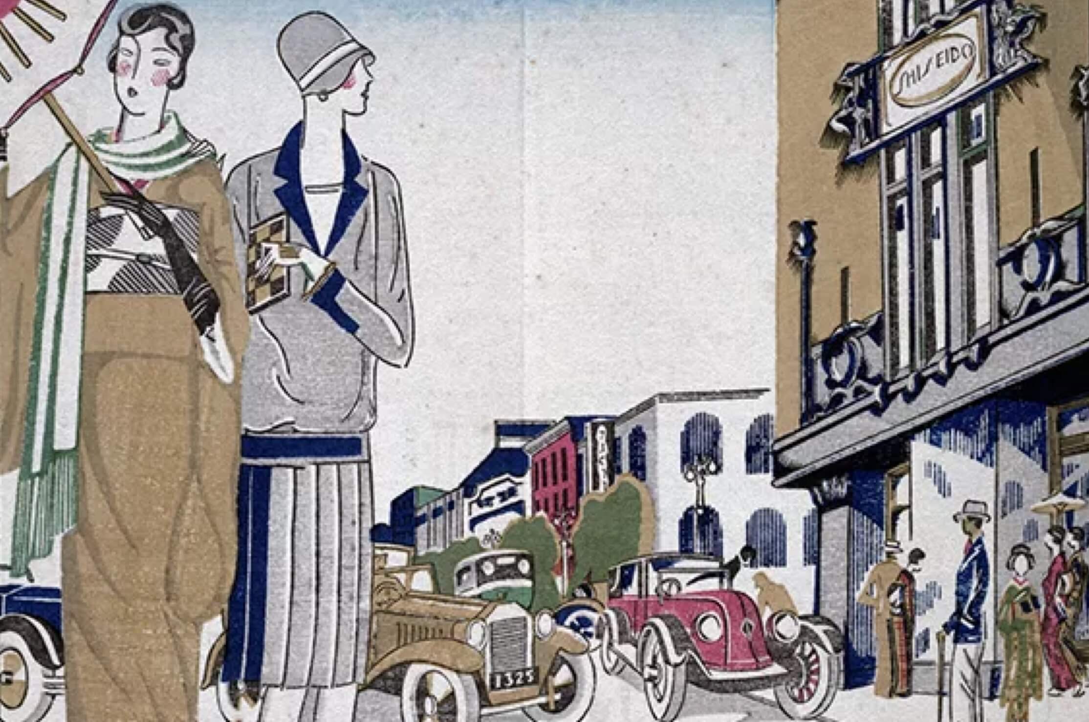
Ginza Edit
Beauty from Japan. From our world to yours.
In Bloom: How SHISEIDO Built A
Brand Identity
From the pretty camellia to an Art Nouveau-inspired font, SHISEIDO’s unmistakeable branding is admired throughout the world.
Story by Laura Brown
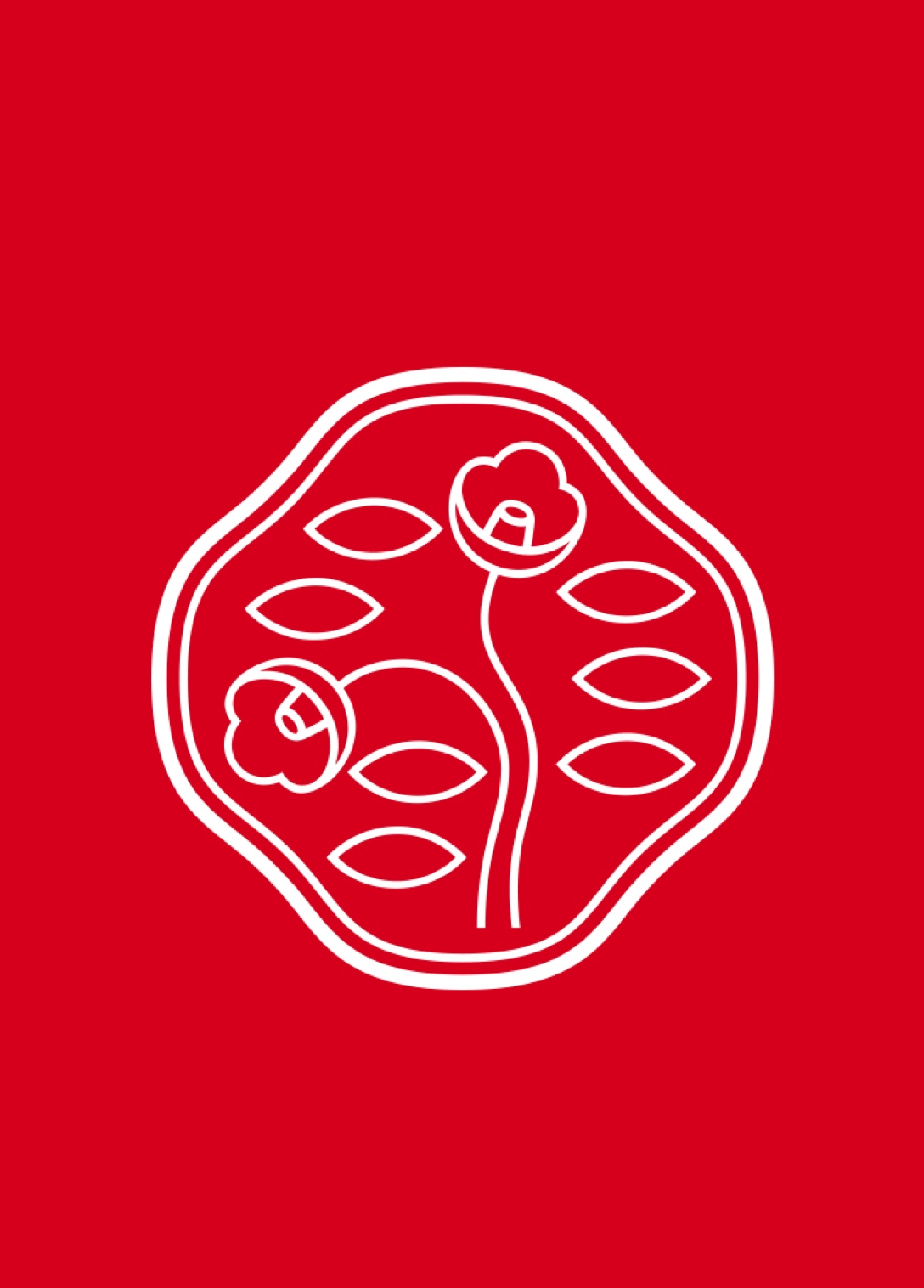
SHISEIDO’s camellia flower logo and distinctive font might, to the untrained eye, look as though they haven’t changed at all over the decades. These design classics have stood the test of time but, if you take a closer look, you’ll notice there have been some subtle tweaks to this beauty brand logo throughout the years. The result is something entirely unique and one that manages to transcend the boundaries of design and art.
-
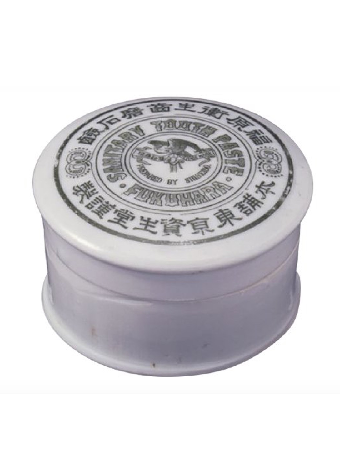
1888
In the early days, SHISEIDO’s logo wasn’t the camellia. Instead, products such as Fukuhara Sanitary Toothpaste featured a hawk. This magnificent bird symbolized founder Arinobu Fukuhara’s bold vision in introducing a Western-style pharmacy to traditional Japan. It wasn’t until the brand branched out into cosmetics that a delicate, more feminine logo was needed.
-
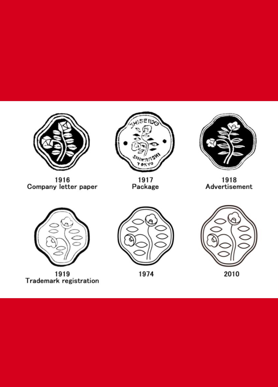
1915
Arinobu’s son Shinzo Fukuhara designed the simple but beautiful camellia logo in the year he took over the company. He had studied art in Europe and was a huge fan of the stylized depictions of flowers in Art Nouveau—plus, the beautiful camellia was his favorite flower.
Shinzo sketched the logo from a camellia in a glass of water—two blooms pointing in different directions to symbolize both aspiration and modesty. For the time, a logo such as this was groundbreaking—most companies in Japan used their family crest. Of course, there have been subtle changes through the years, including dropping the number of leaves to seven before it was registered as a trademark in 1919. Since then, however, it has remained virtually unchanged and distinctly SHISEIDO.
-
1923
Shinzo asked his design department to create an original Japanese typeface for SHISEIDO. Designer Mitsugu Maeda drew the new lettering under the watchful eye of head of department Choyo Takagi, and the final SHISEIDO typeface was born in 1927. It was used for everything from product names and advertisements to menus and gallery notices. Even in this digital age, new designers joining SHISEIDO have to learn to write the typeface freehand.
-
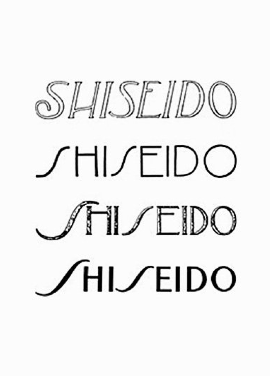
1927
Around the same time, work was under way to create a logo using Western characters. Like the Japanese typeface, the logo was drawn by Mitsugu Maeda, but was soon redesigned by Yabe Sue, who used Shinzo’s beloved Art Nouveau as inspiration for the italicized S (slanting right) and O (slanting left). Since then it has had slight tweaks but it remains true to the original design and, along with the SHISEIDO camellia flower, is instantly recognizable the world over.
A delicate, more
feminine
logo was
born.